I decided to break the ice on my “fear” of art by just playing with my “stuff.” Seems to me, the best place to start is to understand what all this “stuff” looks like in action and how it works. If you read my post Why am I Afraid of Art, you know that when I decide to start something (exclusive of dieting), I jump in with both feet and buy all the supplies I could ever need, whether I need it or not. Problem is I don’t always know what it does or should/could look like. My art journey is no different.
So, since it’s so stinkin’ hot out this weekend I thought I’d pull my stuff out and give it a try. Worst case, it doesn’t do what I think and I put it aside. Best case, I create a sample pallet I can refer to as flex my artistic-ness….or unartistic-ness….however this is going to go.
First up, Brush Pens
I learned of brush pens when I started seeing a page by artist, Dawn Nicole, show up in my Facebook feed. Not sure how her page found me but, I’ve really enjoyed seeing what others are doing. Anyway, Dawn Nicole does some amazing brush lettering…I mean, really beautiful. And, her website offers a huge array of practice sheets you can download. She’s also published books, available on Amazon. It was on her site that I learned about brush pens.

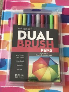
The easiest way to explain them is it’s a magic marker whose tip flexes much like a paintbrush. There are a number of brands on the market for a range of price points, you can buy them online or in art/craft stores (ie: Hobby Lobby or Michael’s), and you can buy them individually or in sets. I purchased Tombow dual tips brand because several articles I read pointed out that they were a bit sturdier and didn’t fray as easily. Dual tip means there’s a different size tip on each end – a heavy point and a thin point. I’m all about flexibility!
I also learned the type of paper you use can affect not only how your brush pen strokes look, but how your brush pen tips hold up over time. Very “grainy” paper will actually fray your tips over time. I had laserjet paper already, so I bought multi-media paper by Strathmore that doesn’t have a lot of fiber to it.
Practice Up and Down
Now, the trick with brush pens and lettering, I’ve come to learn, is press down on the down stroke, and lighten on the up stroke. Pressing down will give you a thicker line; lightening your stroke will give you a thinner/finer line. Of course, you can always use these like a regular marker to color things in. And, you can also use water or alcohol to play with the outcome.

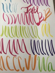
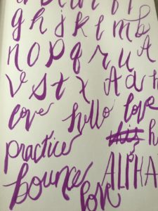
Here’s the sample swatch I did of up and down strokes. I kind of stink at it right now, but truth be told, I’m kind of excited. The key is to figure out how much pressure to put on the up and down strokes….and get a steadier, smoother hand. And that’s…going to take a bit of work. Here’s where I’m trying….yes, I’m trying….to make words…for the love of all things holy, is there a grain of artistic in me???

I think this is going to be fun, but definitely will not be something I get good at without a shit-ton of practice, that’s for sure! Hell, my regular penmanship isn’t great…why would I expect this to be? Again…always one who looks for best and worst case….best case, in no time I’ll be creating beautiful pieces to share with family and friends….worst case, Picasso will have some competition!
